My friend Dana loves, and I mean LOVES, fly fishing. He tried teaching me, it was a disaster. He's been after me to draw fish, specifically ones he likes and wants to catch. So after many many months of his requests, here is the rooster fish that he is so eager to get on the end of his line. More fish to come in the near future, Dana and I have plans for these illustrations.
Showing posts with label animals. Show all posts
Friday, July 25, 2014
Sunday, November 04, 2012
Casa Enrique
Back in mid September I was contacted again by Jesus Diaz, associate art director for The Village Voice. He wanted a spot illustration for a Robert Sietsema article about a restaurant called Casa Enrique in Brooklyn. The restaurant's logo is a shaggy dog wearing a sombrero and Jesus wanted the dog incorporated into the illustration. After reading the article I was practically drooling all over the place because the dishes sounded so tasty. These are the final illustration and the sketches. Personally I loved the cooking ones and so did Jesus, but the team at The Village Voice didn't quite like the idea of a dog cooking.
Thursday, April 19, 2012
Thursday, March 22, 2012
The Printed Bolt - Challenge 1 "Tiny Dwellings"
"Little RV on the Prairie:
"No Shell Like Home"
I'm a contestant in a fabric design competition called Repeat, hosted by The Printed Bolt. It's a six-challenge contest with 10 finalists from around the US. After each challenge there are eliminations of two contesants. The first challenge "Tiny Dwellings" was due last night and is now up for voting. Eliminations are on the 26th and the public can vote for "Reader's Choice."
I started off this first challenge thinking about nomadic homes, which tend to be tiny dwellings, from there I came up with mobile homes as the theme to my designs. The first design, Little RV on the Prairie, features various kinds of man-made mobile homes such as Winnebagos and streamliners in a trailer park. The second design, No Shell Like Home, is aquatic mobile homes; I picked five creatures that move about with their “homes,” like the hermit crab and nautilus. Since the two designs are related and it is springtime, I wanted to use bright colors and coordinate them so they may be used together.
You may see everyone's designs here:
www.theprintedbolt.com
Tuesday, August 09, 2011
Airplanes, people, and animals
It's been a while since my last real post. I finally got time and my act together today to scan (and color) some sketches that I've done in the past month in Tanzania.
The first two were done on two different flights on Coastal Aviation to Zanzibar. The first drawing a view from my seat in the back. The second is from sitting behind the two captains seats.
The next two are of my friend, Dana, fly fishing in Zanzibar. Unfortunately, he didn't catch anything, but I did get the opportunity to draw someone fishing for the first time!
The next set of drawings were made in Ruaha National Park, which is southwest of Dar es Salaam, about 625 kilometers away.
The first two were done on two different flights on Coastal Aviation to Zanzibar. The first drawing a view from my seat in the back. The second is from sitting behind the two captains seats.
The next two are of my friend, Dana, fly fishing in Zanzibar. Unfortunately, he didn't catch anything, but I did get the opportunity to draw someone fishing for the first time!
The next set of drawings were made in Ruaha National Park, which is southwest of Dar es Salaam, about 625 kilometers away.
Thursday, February 24, 2011
Fur Free Alliance - Design Against Fur poster competition
Furocious
11 x 17 inches
Pen and Digital
The latest project we worked on in Poster Illustration revolved around political/social/environmental issues/causes. We had the option of doing whatever or creating a poster for the Fur Free Alliance's Design Against Fur competition. I had a number of ideas ranging from fur-free to recycling to pollution. I ended up going with my concept for the Fur Free poster.
11 x 17 inches
Pen and Digital
The latest project we worked on in Poster Illustration revolved around political/social/environmental issues/causes. We had the option of doing whatever or creating a poster for the Fur Free Alliance's Design Against Fur competition. I had a number of ideas ranging from fur-free to recycling to pollution. I ended up going with my concept for the Fur Free poster.
Tuesday, May 25, 2010
On Location - SCAD Equestrian Center
Location #3 - SCAD Equestrian Center. Drew some horses and come classmates.
watercolor and pen in Moleskine watercolor folio
8.5 x 12 inches
On location - Oatland Island Wildlife Center
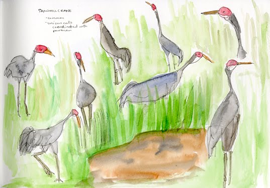
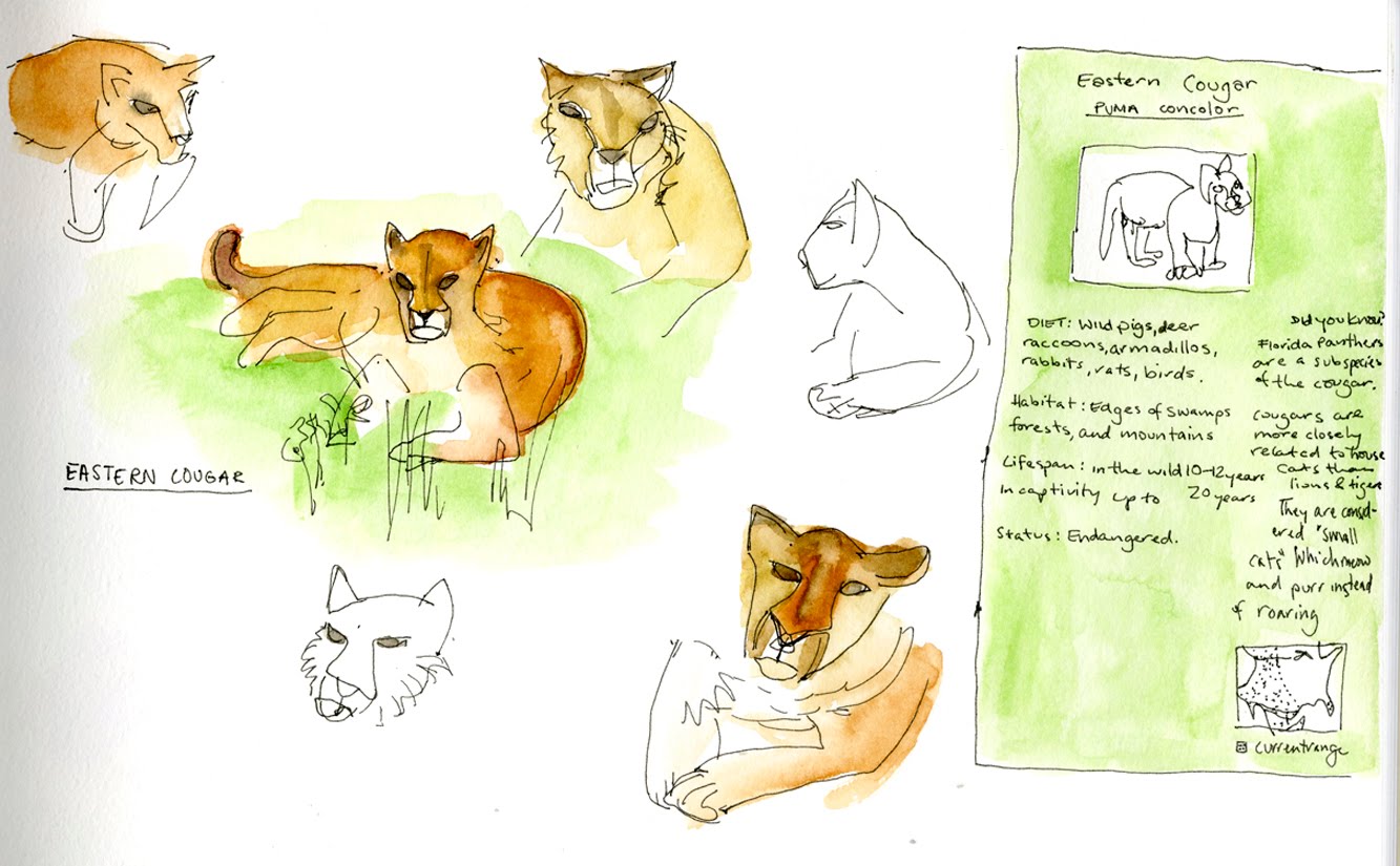
Location #2: Oatland Island Wildlife Center
Water color and pen in a Moleskin watercolor folio
8.5 x 12 inches
Friday, May 07, 2010
In Character - A Journal of Everyday Virtues
In Illustration Markets last week we submitted our editorial assignments. The assignment was to create three illustrations - one cover, and two spots - for In Character magazine. Each issue of the magazine is about one virtue. The few that got picked by other students were honesty, generosity, wisdom, and one more but I can't remember the word, something to do with selflessness. The issue I chose was the Grit issue. Grit means "stick-to-it-ness," perseverance, not giving up.
I read a few articles and decided to go with one about Seabiscuit the racehorse from the 30s/40s, and an article on Albert Einstein and how he never gave up even though his peers often did.
The Einstein article talked about how he never gave up or lost hope, Einstein was determined to find results. The article quotes Einstein describing himself as "an ostrich with [his] head forever buried in the sands of relativity." This quote stuck to me and lead my to the final drawing. Since I had to have consistency in the images I created, and this one had lots of ostriches in it, it only made sense to carry the animal theme through out the rest of the pieces, which also worked out well since Seabiscuit is a horse. I also had to continue using the element of type so the text didn't seem random.
Pen, ink, watercolor and digital color
8 x 7.5 inches
The Seabiscuit article describe the horse as, to put it in one word, awkward. The article had a whole list of characteristics that were wrong and not beneficial for racehorses, all characteristics that Seabiscuit seemed to have. Seabiscuit apparently lost every race for two years, or something like that, apparently it was because his trainer didn't care much for him. There was a change of trainer and the second one gave poor awkward Seabiscuit some TLC and the horse went on to become one of the greatest racehorses in racing history.
This is my spot illustration for the article.
Pen, ink, watercolor and digital color.
7.5 x 5 inches
And finally, the cover. The cover was a bit of a challenge. I had to show "grit" but not really reference any of the articles but just illustrate what the word means. Plus I had to use animals and text. I researched sea turtles, humpback whales, penguins, and hammer head sharks. All these animals have to go on long, hard voyages in order to reproduce/eat. But I felt that they were too obvious a solution. I ended up choosing African termites! They build mounds that can sometimes be over six feet tall! They've definitely got some grit. The cover illustration became the only one without text that I created, but it has the journal and issue name so I think that counts as type.
Pen, ink, watercolor and digital color
10 x 7.5 inches
All three are dated April not May.
I read a few articles and decided to go with one about Seabiscuit the racehorse from the 30s/40s, and an article on Albert Einstein and how he never gave up even though his peers often did.
The Einstein article talked about how he never gave up or lost hope, Einstein was determined to find results. The article quotes Einstein describing himself as "an ostrich with [his] head forever buried in the sands of relativity." This quote stuck to me and lead my to the final drawing. Since I had to have consistency in the images I created, and this one had lots of ostriches in it, it only made sense to carry the animal theme through out the rest of the pieces, which also worked out well since Seabiscuit is a horse. I also had to continue using the element of type so the text didn't seem random.
Pen, ink, watercolor and digital color
8 x 7.5 inches
The Seabiscuit article describe the horse as, to put it in one word, awkward. The article had a whole list of characteristics that were wrong and not beneficial for racehorses, all characteristics that Seabiscuit seemed to have. Seabiscuit apparently lost every race for two years, or something like that, apparently it was because his trainer didn't care much for him. There was a change of trainer and the second one gave poor awkward Seabiscuit some TLC and the horse went on to become one of the greatest racehorses in racing history.
This is my spot illustration for the article.
Pen, ink, watercolor and digital color.
7.5 x 5 inches
And finally, the cover. The cover was a bit of a challenge. I had to show "grit" but not really reference any of the articles but just illustrate what the word means. Plus I had to use animals and text. I researched sea turtles, humpback whales, penguins, and hammer head sharks. All these animals have to go on long, hard voyages in order to reproduce/eat. But I felt that they were too obvious a solution. I ended up choosing African termites! They build mounds that can sometimes be over six feet tall! They've definitely got some grit. The cover illustration became the only one without text that I created, but it has the journal and issue name so I think that counts as type.
Pen, ink, watercolor and digital color
10 x 7.5 inches
All three are dated April not May.
Saturday, December 12, 2009
A study of dogs
My uncle (my dad's cousin) just got two 11 week old Alsatian puppies. Last night my parents and I went over to his house to meet canine siblings - Rocky (brother) and Simba (sister). I took my new sketchbook along to get a few dog studies to break the book in. When we got home, I painted some of them in with water color.
Simba and Rocky cuddling
Either Rocky or Simba rolling.
Rocky x2
In the sketch above, Rocky kept moving around, so the sketch is from all sorts of different angles! (the caption reads: the movement made him ugly).
Rocky.
Below are two sketches. The first is of my uncle sitting next to his niece. And the second is of my aunt.

Simba and Rocky cuddling
Either Rocky or Simba rolling.
Rocky x2
In the sketch above, Rocky kept moving around, so the sketch is from all sorts of different angles! (the caption reads: the movement made him ugly).
Rocky.Below are two sketches. The first is of my uncle sitting next to his niece. And the second is of my aunt.

Thursday, August 06, 2009
Shark week hoo-ha-ha
I got my wisdom teeth removed on July 28th so the past 10 days have revolved around my teeth and how my face is feeling etc, and having to give full detailed updates to my mom on my mandible status. At some point I started thinking up scenarios involving different animals at the dentist's office. I read some where that its Shark Week on the Discovery Channel so my mind wandered over to sharks and their many teeth; also saw Renee's blog update which inspired me to actually draw my idea despite all the packing I need to do!
I sketched the drawing first, photographed it, and colored it in Photoshop.

ps: the title of this post comes from Finding Nemo when Nemo is getting initiated in the fish tank, and the other fish chant/yell "shark bait hoo-ha-ha".
I sketched the drawing first, photographed it, and colored it in Photoshop.

ps: the title of this post comes from Finding Nemo when Nemo is getting initiated in the fish tank, and the other fish chant/yell "shark bait hoo-ha-ha".
Monday, October 06, 2008
Subscribe to:
Posts (Atom)