Showing posts with label Celebrities. Show all posts
Tuesday, June 22, 2010
Tuesday, May 25, 2010
Amy Winehouse
Amy Winehouse
3D Illustration - fabric, Paperclay, wire, paint, wood, other stuff, Photoshop
10 x 7 inches
actual figure - 15 x 8 x 8 inches
Project #3 in Illustration Markets was to interview an illustrator working today and make an art piece for the same market that the interviewee works in. I interviewed Chris Sickels a few weeks ago. He works in a lot of different markets but primarily editorial illustration. Since Sickels works in 3D, I chose to the the same. I made Amy Winehouse.
She was a TON of fun to make. Making the accessories and clothing was the best part; it was a bit like grown up paperdolls. The purse is my favorite part. It's made from a furry leaf or seedpod I found on the street. I soaked it in water to soften it to make it easier to sew. After it dried, it stiffened up and held the sewn form. I stuffed it with a tiny flask I made and a bag of coke (corner of a ziplock bag filled with salt, then sealed).
I photographed her with the help of Megan Berkheiser, Drawing For illustrators professor, and her husband, Mike. Megan works three dimensionally too so I was able to get lots of feed back from her on how to go about working on the background. I drew and painted the background on paper with watercolors, scanned it in and worked it up on Photoshop, playing with color saturations, levels, and textures.
Friday, May 07, 2010
In Character - A Journal of Everyday Virtues
In Illustration Markets last week we submitted our editorial assignments. The assignment was to create three illustrations - one cover, and two spots - for In Character magazine. Each issue of the magazine is about one virtue. The few that got picked by other students were honesty, generosity, wisdom, and one more but I can't remember the word, something to do with selflessness. The issue I chose was the Grit issue. Grit means "stick-to-it-ness," perseverance, not giving up.
I read a few articles and decided to go with one about Seabiscuit the racehorse from the 30s/40s, and an article on Albert Einstein and how he never gave up even though his peers often did.
The Einstein article talked about how he never gave up or lost hope, Einstein was determined to find results. The article quotes Einstein describing himself as "an ostrich with [his] head forever buried in the sands of relativity." This quote stuck to me and lead my to the final drawing. Since I had to have consistency in the images I created, and this one had lots of ostriches in it, it only made sense to carry the animal theme through out the rest of the pieces, which also worked out well since Seabiscuit is a horse. I also had to continue using the element of type so the text didn't seem random.
Pen, ink, watercolor and digital color
8 x 7.5 inches
The Seabiscuit article describe the horse as, to put it in one word, awkward. The article had a whole list of characteristics that were wrong and not beneficial for racehorses, all characteristics that Seabiscuit seemed to have. Seabiscuit apparently lost every race for two years, or something like that, apparently it was because his trainer didn't care much for him. There was a change of trainer and the second one gave poor awkward Seabiscuit some TLC and the horse went on to become one of the greatest racehorses in racing history.
This is my spot illustration for the article.
Pen, ink, watercolor and digital color.
7.5 x 5 inches
And finally, the cover. The cover was a bit of a challenge. I had to show "grit" but not really reference any of the articles but just illustrate what the word means. Plus I had to use animals and text. I researched sea turtles, humpback whales, penguins, and hammer head sharks. All these animals have to go on long, hard voyages in order to reproduce/eat. But I felt that they were too obvious a solution. I ended up choosing African termites! They build mounds that can sometimes be over six feet tall! They've definitely got some grit. The cover illustration became the only one without text that I created, but it has the journal and issue name so I think that counts as type.
Pen, ink, watercolor and digital color
10 x 7.5 inches
All three are dated April not May.
Wednesday, April 07, 2010
Freddie Mercury
Freddie Mercury
watercolor, pen and ink, digital
8.5 x 11 inches
The first project in Illustration Markets was to pick a celebrity with some sort of juicy history and make a portrait. We were given a stamp template and were asked to scan and drop our portraits into the template. I chose Freddie Mercury from Queen.
Link to a few of the prelim sketches
Thursday, April 01, 2010
I want to break freeee.
Sketches and studies of Freddie Mercury for the celebrities project in Illustration Markets.
I'm really liking this quarter so far. I'm taking two illustration classes and one fibers class (elective). And my two illu profs, Kurt Vargo and Megan Berkheiser, are super awesome. They know so much about the industry and have so many stories to tell. They're also encouraging me (and other students) to work in a manner we feel most comfortable. Since I love drawing with my pen, they both want me to continue doing that and will help me develop more line-vocabulary to incorporate into my work to make it more interesting. It's a great feeling knowing that my final piece will pretty much have the same feel/quality/mood as my sketches - something that wasn't necessarily translating through before.
Tuesday, March 09, 2010
Ringo
Ringo
3D Illustration - fabric, Paperclay, wire, gesso, acrylic, gouache, wood
For our final projects in Illustration Techniques II we got to choose from the assignments we all wrote earlier this quarter. I decided to do Jeff's 3D illustration assignment which expanded on last quarter's project to make a musician (to be eventually used on in Rolling Stone Magazine). Jeff's project wasn't limited to musicians but I decided to continue with The Beatles and make Ringo playing the drums. This assignment not only required me to build models but also to photograph them to create a scene/mood.
During the Ringo Photoshoot, I also included John.
Some photos that didn't quite make the cut:
3D Illustration - fabric, Paperclay, wire, gesso, acrylic, gouache, wood
For our final projects in Illustration Techniques II we got to choose from the assignments we all wrote earlier this quarter. I decided to do Jeff's 3D illustration assignment which expanded on last quarter's project to make a musician (to be eventually used on in Rolling Stone Magazine). Jeff's project wasn't limited to musicians but I decided to continue with The Beatles and make Ringo playing the drums. This assignment not only required me to build models but also to photograph them to create a scene/mood.
During the Ringo Photoshoot, I also included John.
In Giant-World:
Some photos that didn't quite make the cut:
Tuesday, November 17, 2009
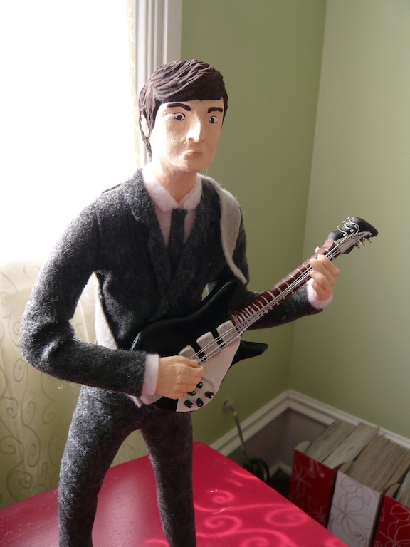
3D Illustration: John Lennon and his Rickenbacker


John Lennon
16.5 inches
wire, gouache, acrylic, gesso, aluminum foil, felt, pins, liquid laminate
For our final Illustration Techniques I project we had to make a 3D illustration of a musician to potentially go in Rolling Stone Magazine. I narrowed my list of artists down to David Bowie and John Lennon, and ultimately chose Lennon. I took pictures with my phone while I made him. It was more fun that I was expecting it to be, and definitely more rewarding towards the end when everything started coming together. At times I felt like a surgeon reattaching extremities, and other times I felt like a tailor, cutting out and piecing together the felt for the suit. I had to cut the pieces much like clothing patterns for them to drape properly.
Lennon was sculpted from this material called Paperclay. It is essentially airdrying clay made from volcanic ash, paper pulp and a few other random things. It was easy and hard to work with depending on situation. I made a basic frame from armature wire, covered it in aluminum foil then applied the clay to the structure. At some point I had to adjust the posture a little so that he can stand. I painted John with gouache, and added liquid laminate to his shoes for the shine. The suit is made from felt. The guitar is paperclay painted with gesso, acrylic paint. I used thin wire wrapped on tiny pins for the strings and tuners.
My professor, Ed Briant put up the pictures he took of the project on his website.
John joins the Mantel Collection:

Work in progress:


Subscribe to:
Posts (Atom)